
Investing Update: Bearish Data Emerges
What I'm buying, selling & watching
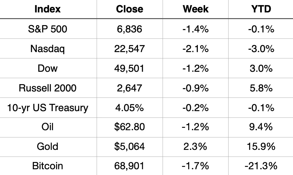
U.S. equity markets closed out the week in the red, with tech stocks leading losses. The Nasdaq fell 2.1% for the week, followed by the S&P 500 down 1.4% and the Dow losing 1.2%. The Russell 2000 held up relatively better, declining just 0.9%.
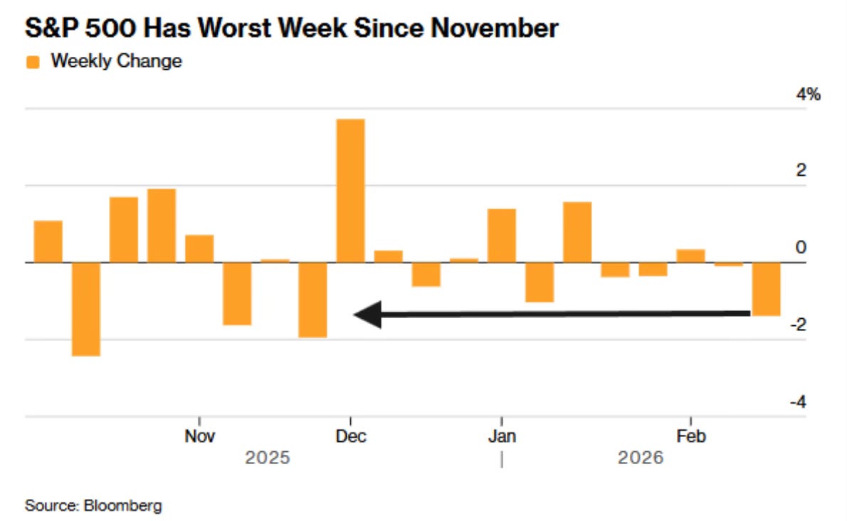
It was the worst week for the S&P 500 since November.
While the week was broadly negative, the picture YTD remains mixed. The Dow and Russell 2000 are both positive for the year at +3.0% and +5.8% respectively, while the Nasdaq (-3.0%) and S&P 500 (-0.1%) are in slightly negative territory. Gold continues to be 2026’s best performer.
The market’s modest pullback this week suggests some consolidation after the year’s start, with investors potentially reassessing valuations heading into the middle of February.
Market Recap
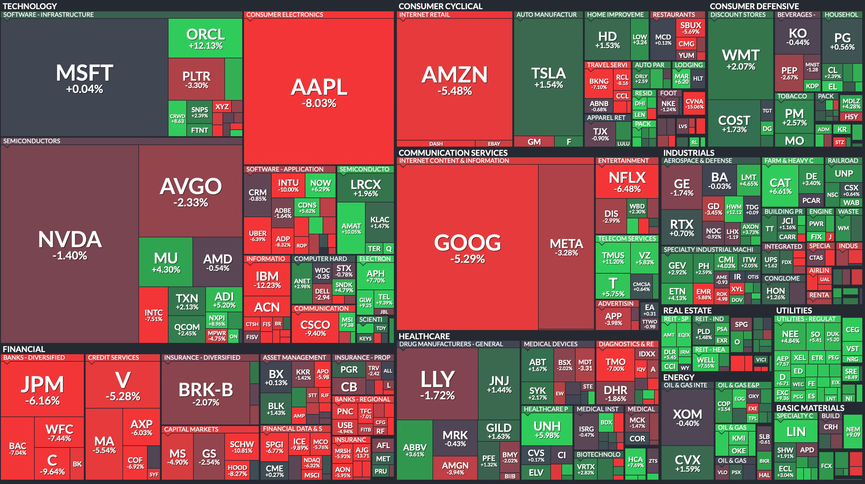
Weekly Heat Map Of Stocks
Before diving into the concerns, it's important to acknowledge what's working in this market. Breadth, a measure of how many stocks are participating in the rally is at its strongest level in over a year. All nine major S&P 500 sectors are now trading above their 200-day moving averages, a feat last achieved in November 2024.
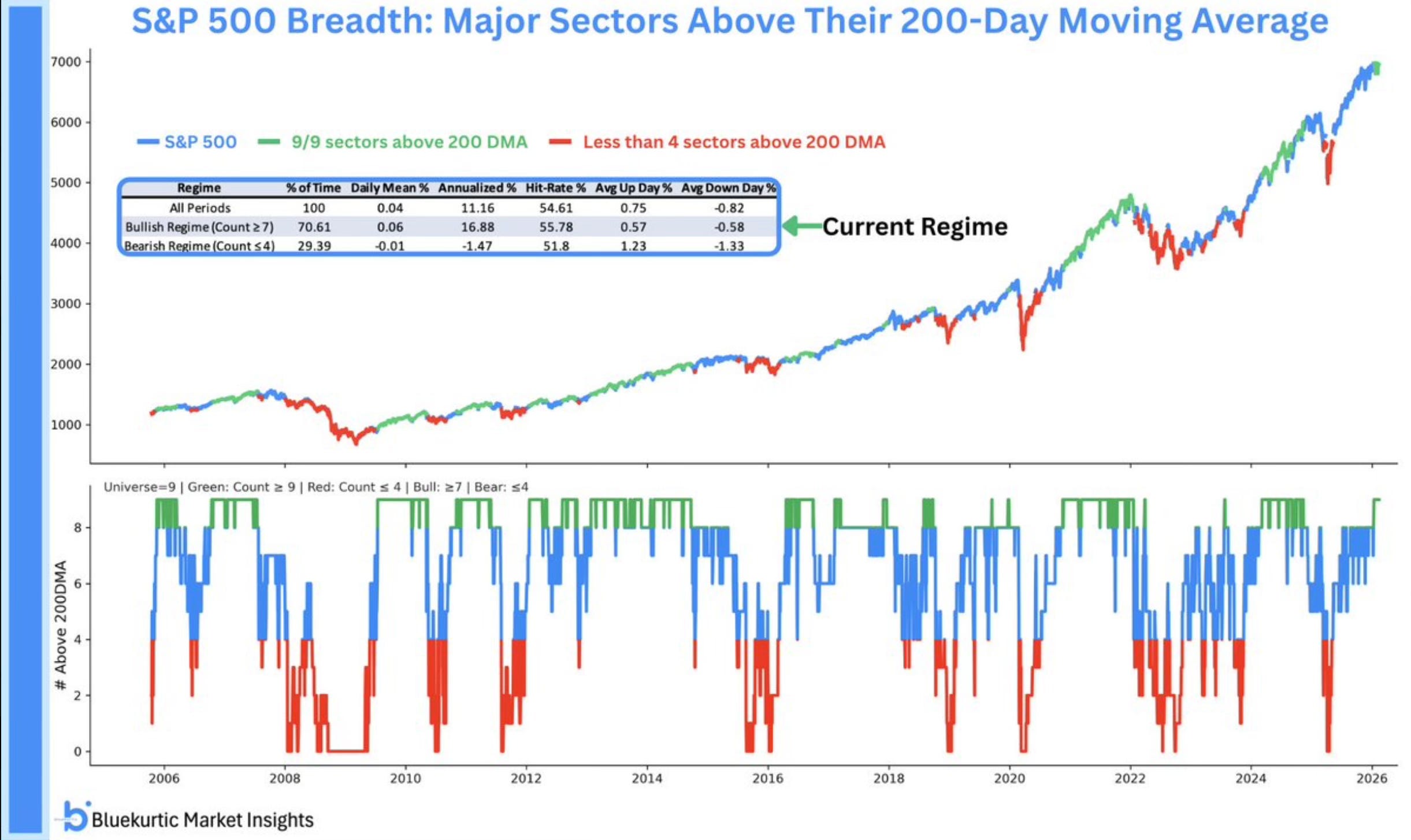
When every sector is in an uptrend, it's difficult to make a convincing bearish argument. This kind of broad participation typically supports continued market strength.
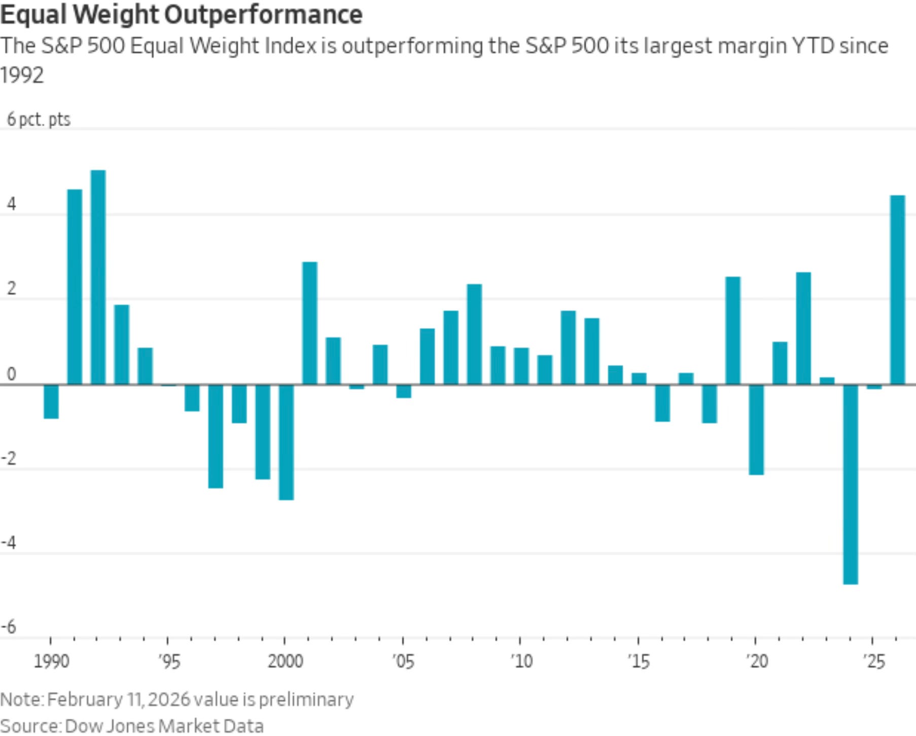
The equal-weight S&P 500, which gives equal importance to each stock rather than favoring mega-caps, continues to outperform the traditional market-cap weighted index by the widest margin since 1992. This confirms that the rally isn't just driven by a handful of large companies, it's genuinely broad-based.
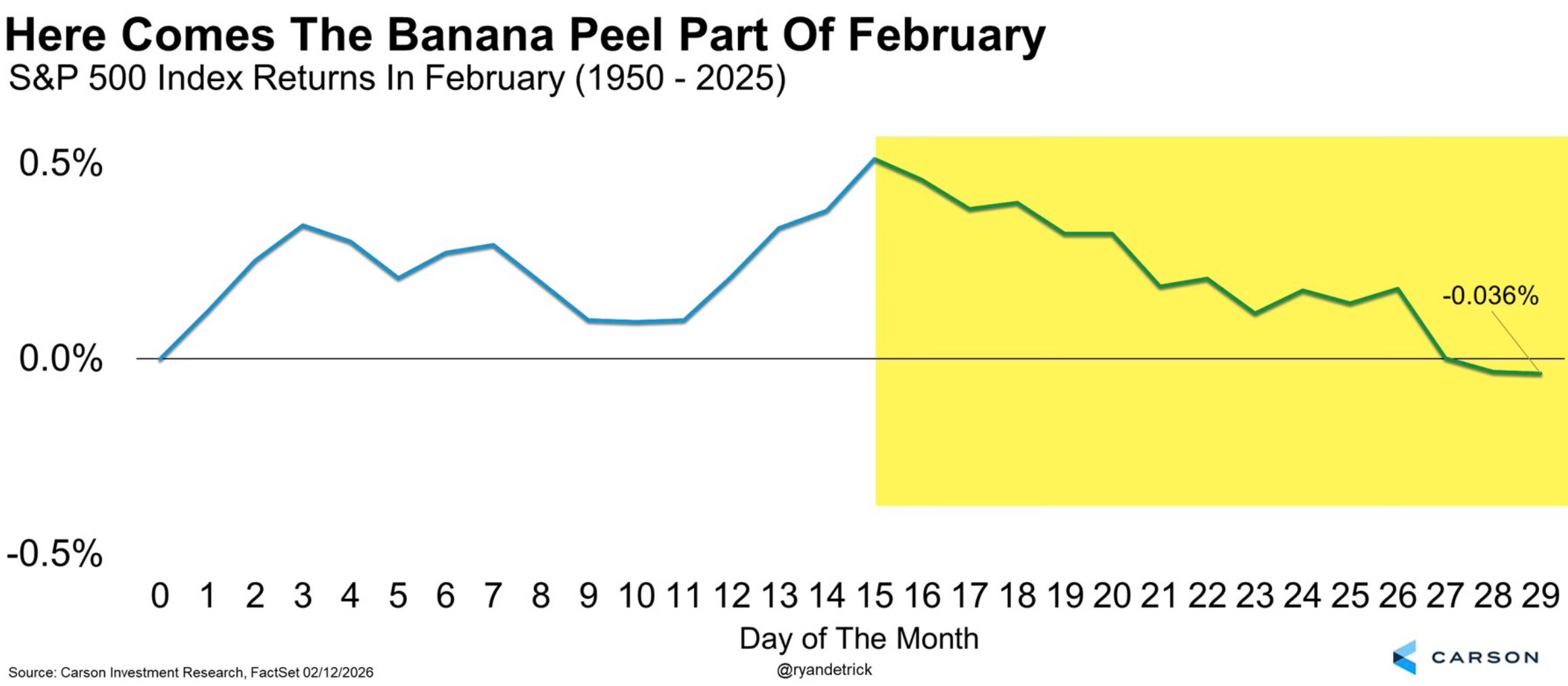
Keep in mind the seasonal headwind: we’re entering the second half of February, historically the weakest stretch of what’s already one of the year’s most challenging months for stocks.
The problem isn’t breadth, it’s what’s leading. While having all sectors above their 200-day moving averages sounds positive, the composition of that leadership raises red flags.
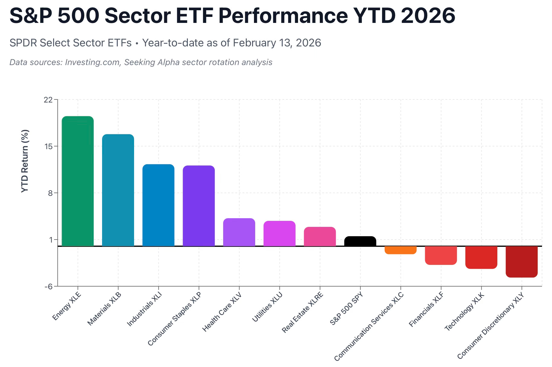
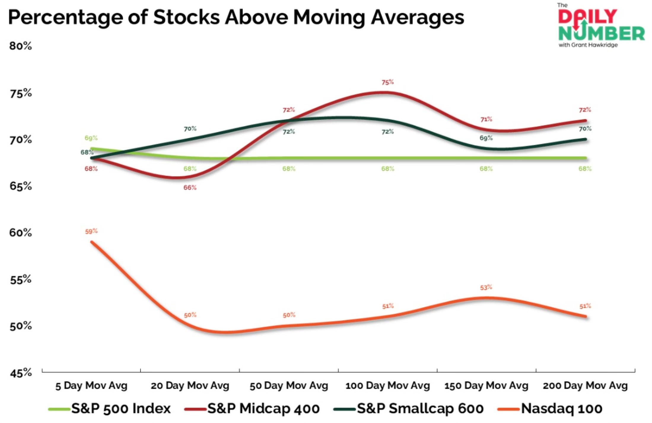
Currently, the materials sector has the highest percentage of stocks above their 200-day moving average, followed by energy and utilities. These aren’t typically the sectors that lead sustainable bull markets. Meanwhile, communications and technology, the traditional growth engines, are the only two sectors where less than half of stocks are above their 200-day averages.
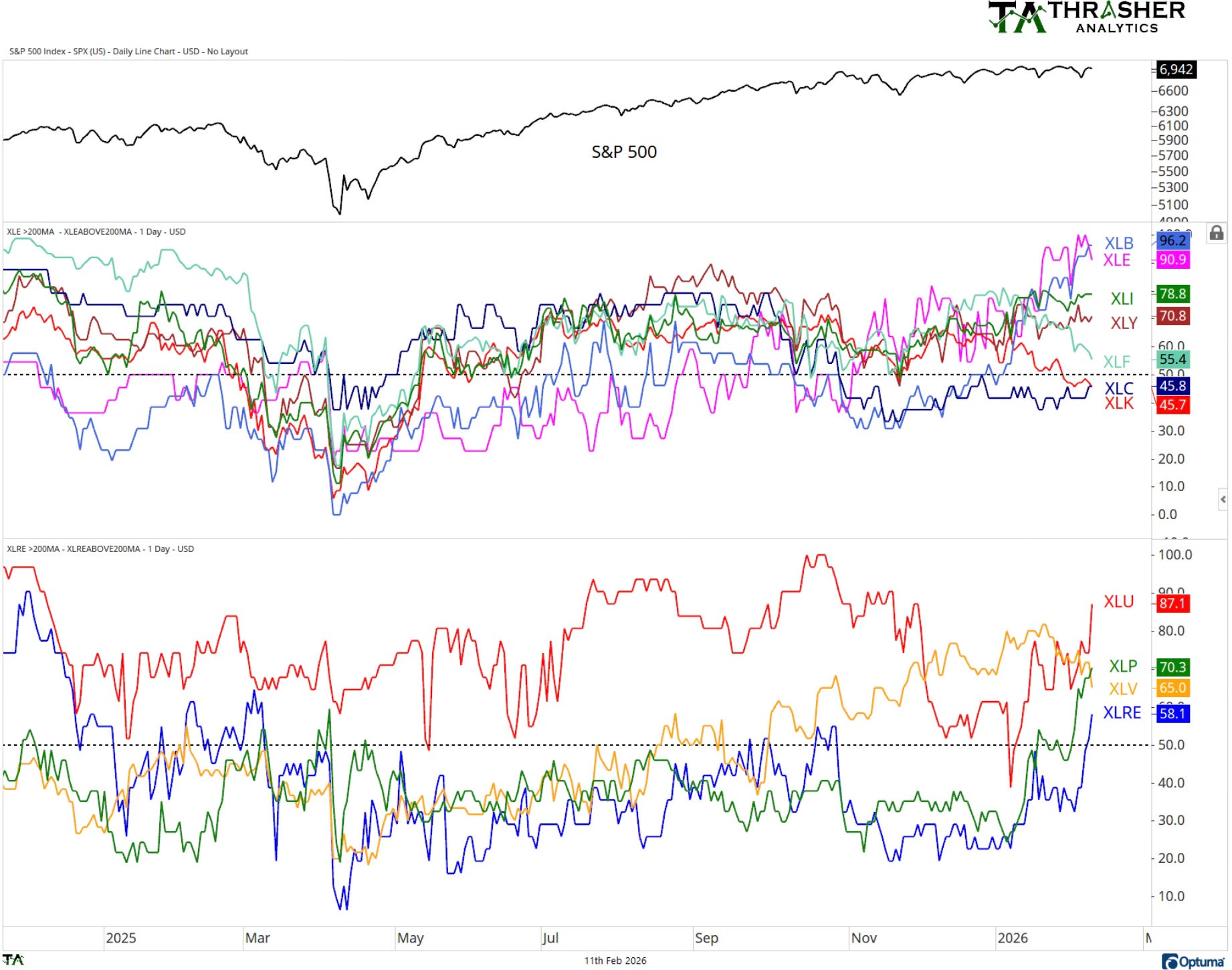
The divergence is even more stark when you zoom in: only 51% of Nasdaq stocks are trading above their 200-day moving average, compared to 68% for the broader S&P 500. Technology stocks, which make up the bulk of the Nasdaq, are clearly lagging despite the positive headline breadth numbers.
Perhaps most concerning is what's happening beneath the market's seemingly stable exterior. I think this was the chart of the week from Michael Batnick.
Wild market. We haven't seen anything like this since the dotcom bubble burst.
Over the last 8 sessions, 115 stocks in the S&P 500 have decline 7% or more in a single day.
The average drawdown when that happens is 34%. Right now we're 1.5% below the all-time high.
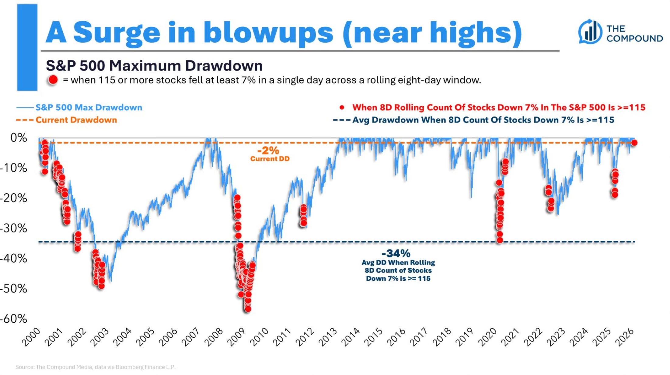
This is extraordinary carnage for individual stocks that’s being masked by the index’s stability. We haven’t seen this kind of single-stock volatility and weakness since the dot-com bubble burst. Historically, when this many stocks experience such severe single day declines in such a short period, the average subsequent market drawdown has been 34%.
Yet here we are, just 1.5% below all-time highs.
This creates a troubling picture: broad indices appearing stable while individual stocks are getting crushed, defensive sectors leading while growth lags, and record levels of single-stock stress occurring while the market trades near record highs. These are the conditions that often precede more significant market dislocations.
Bearish Data Emerges
While the market's weekly decline may seem modest, the internals are flashing warning signals that historically precede more significant weakness. Let’s take a look at what I’m seeing.