
Investing Update: Apple Joins The Party
What I'm buying, selling & watching
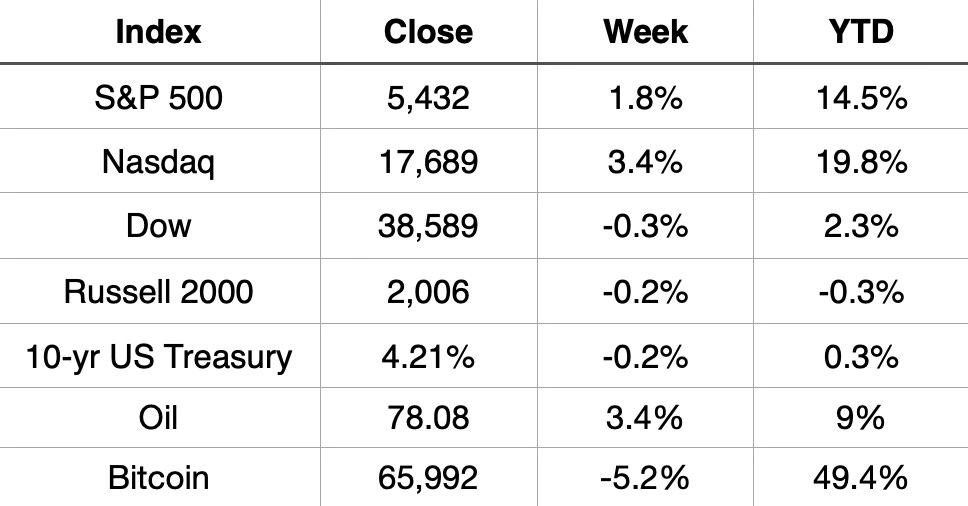
This week saw 4 days in a row of new all-time highs for the S&P 500. That now makes 29 new all-time high for the year. It was the 7th positive week out of the last 8.
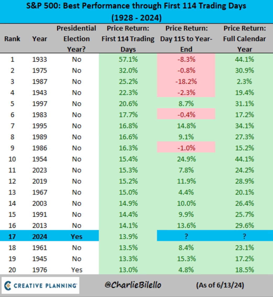
Through the first 114 trading days of the year, this is the 17th best start to a year ever. The best start to a presidential election year ever.
As the Nasdaq and the S&P 500 shine, the Dow and small caps haven’t. The Dow ended the week down 4 days in a row. It trails the S&P 500 by 12.2% so far this year. The Russell 2000 actually turned back to negative on the year. Small caps just remain out of favor.
Market Recap
The Inflation Fight
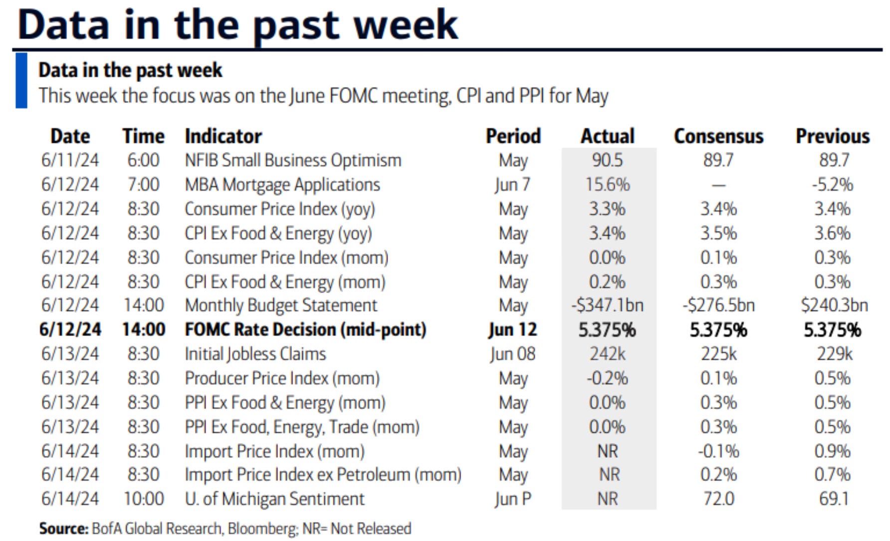
Wednesday brought good news on the inflation front. The CPI inflation number came in at 3.3%. The expectation was 3.4%. Core inflation declined to 3.4%. The expectation was 3.5%. That’s the lowest level since April 2021.
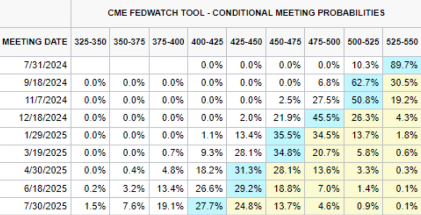
This has now changed the probabilities for when the Fed will look to cut interest rates. The CME Fedwatch Tool probabilities of rate hike went up to a 62% chance of a rate cut to now happening at the September meeting.
Here is a chart that shows the 12-month change of certain segments and where inflation still is and where it isn’t. Auto insurance is still miles ahead of any other area. It’s followed by rent and housing.

As the inflation fight continues, this chart from BofA really stuck out to me. It’s wild to see how closely CPI has tracked from the 1967-1985 period to the 2014-present period. I liked the “History doesn’t repeat but it rhymes, even inflation history.”
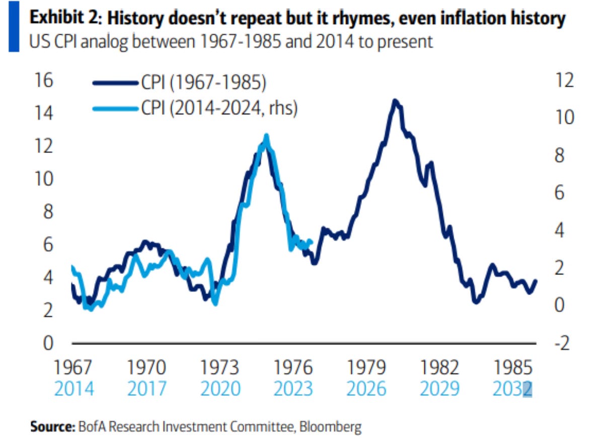
Chart of the Week
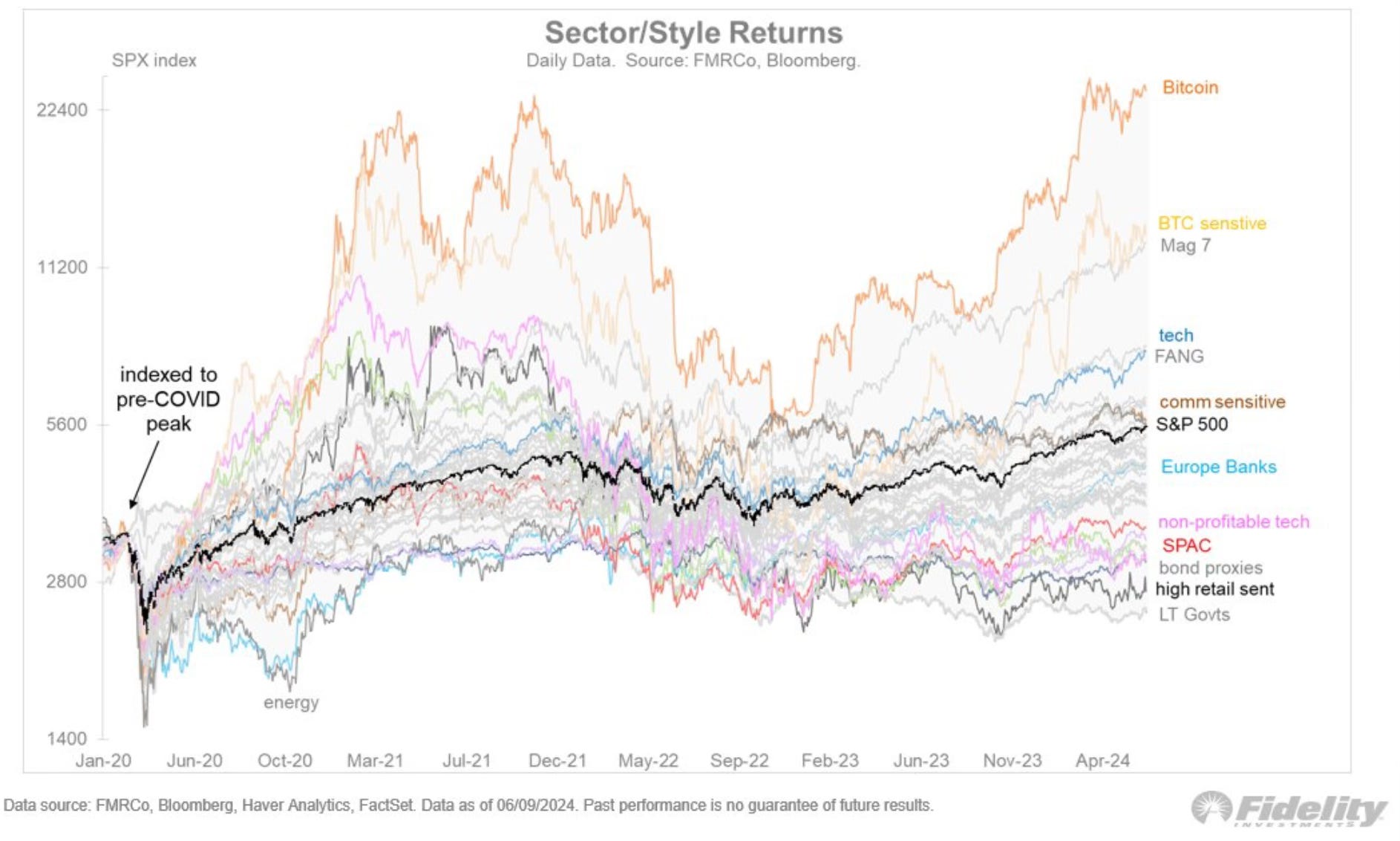
I loved this chart from Jurrien Timmer this week. He indexed various sectors and investment assets back to the pre-COVID peak up until today. Take a look at some of these returns. Far outperformance from Bitcoin and the Mag 7. Look at the fall non-profitable tech has taken from mid-2021 to now.
Recession Word Fading Away
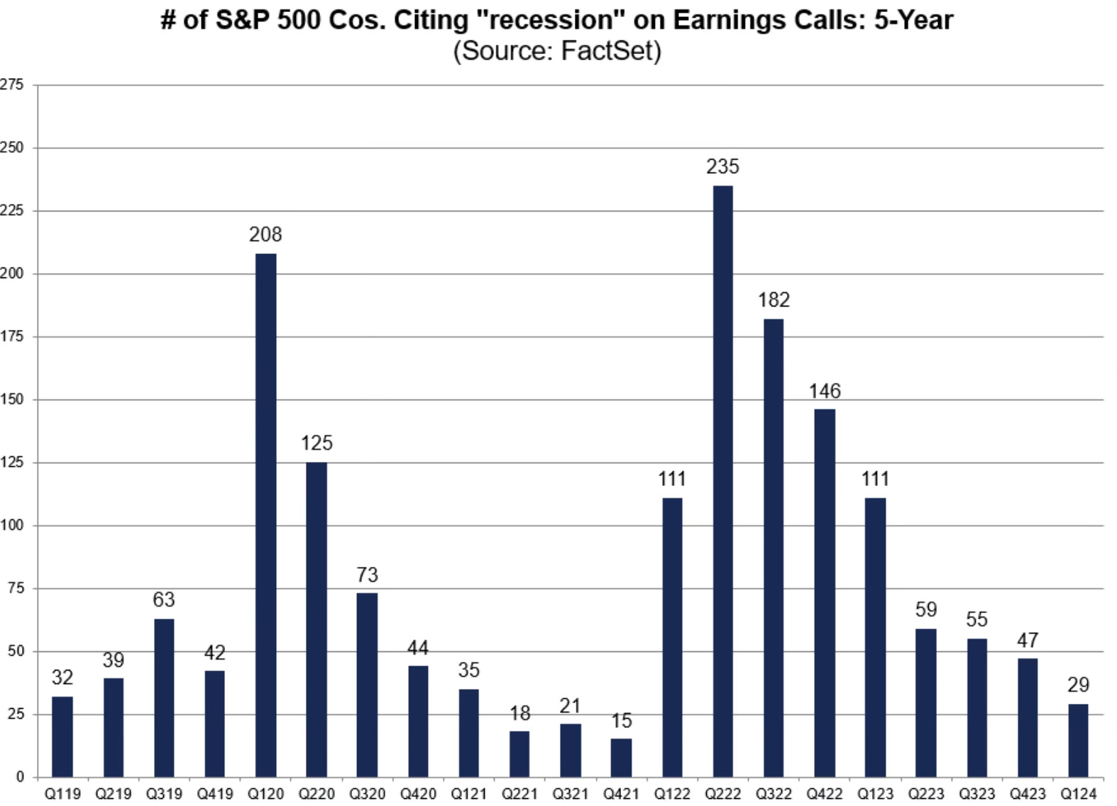
The talk of recession has now also left earnings calls. The number of S&P 500 companies citing the word recession on earnings calls has collapsed. In the Q1 earnings calls that just finished up, only 29 companies mentioned recession.
In the past 21 quarters of earnings calls, which goes back to Q1 2019. This quarter marks the 4th fewest number of times the word recession has been mentioned.
An Opportunity?
When I look for areas of opportunity, one of the places to look is what has been oversold and where positioning has become outsized in one direction or another.
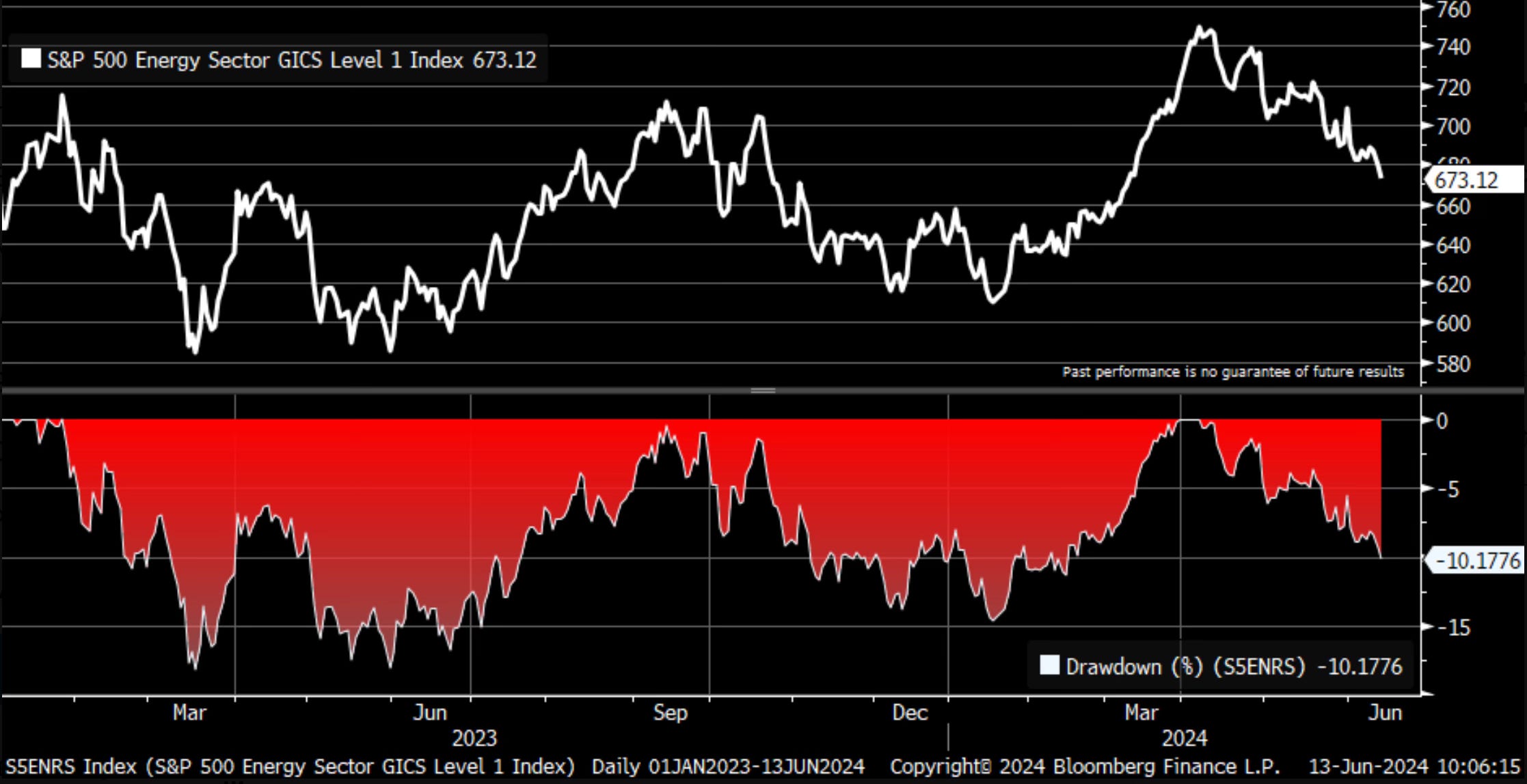
One area that fits that bill currently, is oil and the energy sector. The XLE (Energy Select Sector SPDR Fund) is now down 10.24% from its peak in early April.
Hedge fund positioning to oil is currently at the lowest level in over a decade. It has even fallen below the COVID levels, which is a big surprise to me. Remember on April 21, 2020 oil was negatively priced for the first time in history.
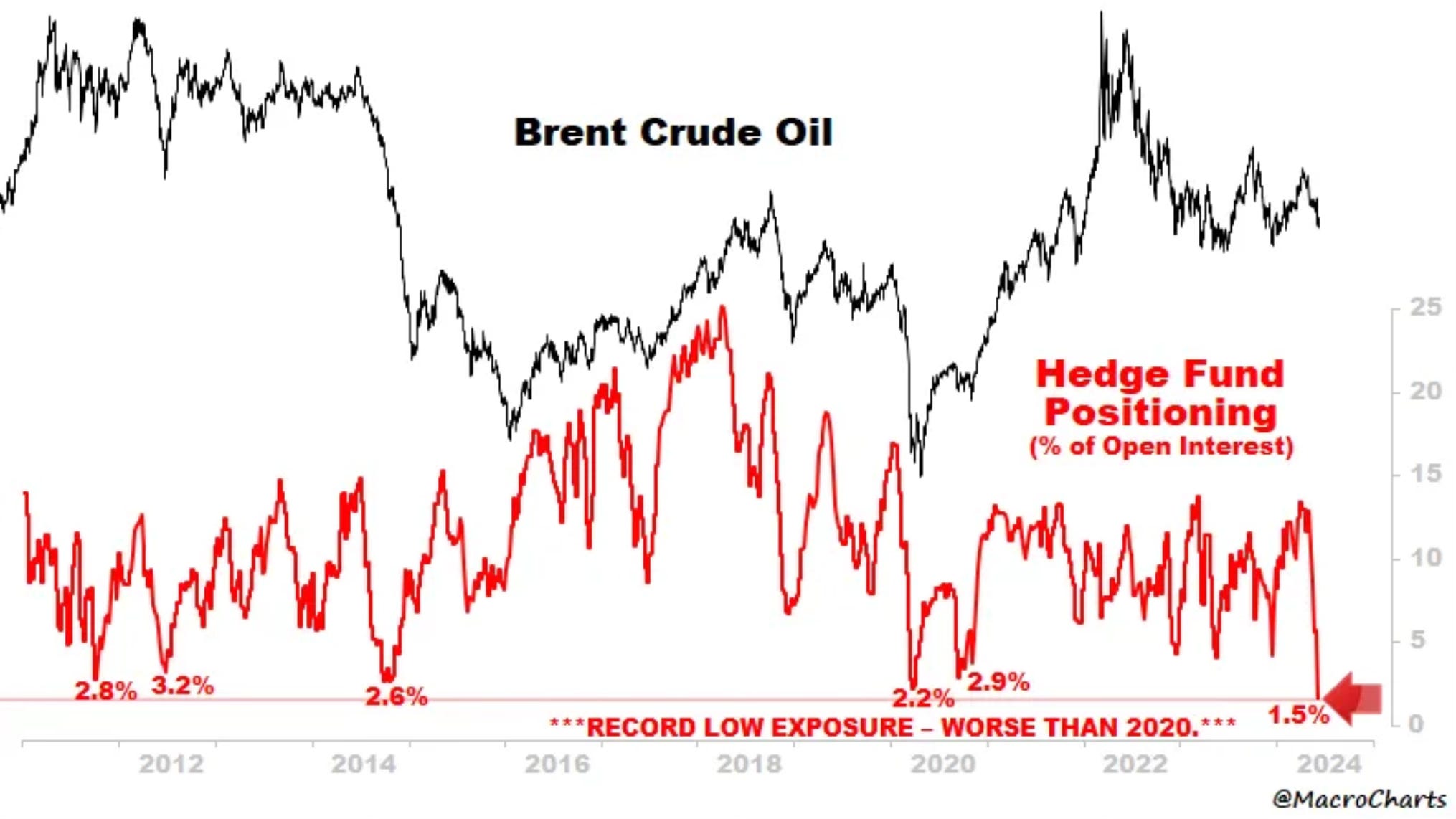
You can see by this chart that the energy sector has now fallen into correction territory.
Two Noteworthy Charts
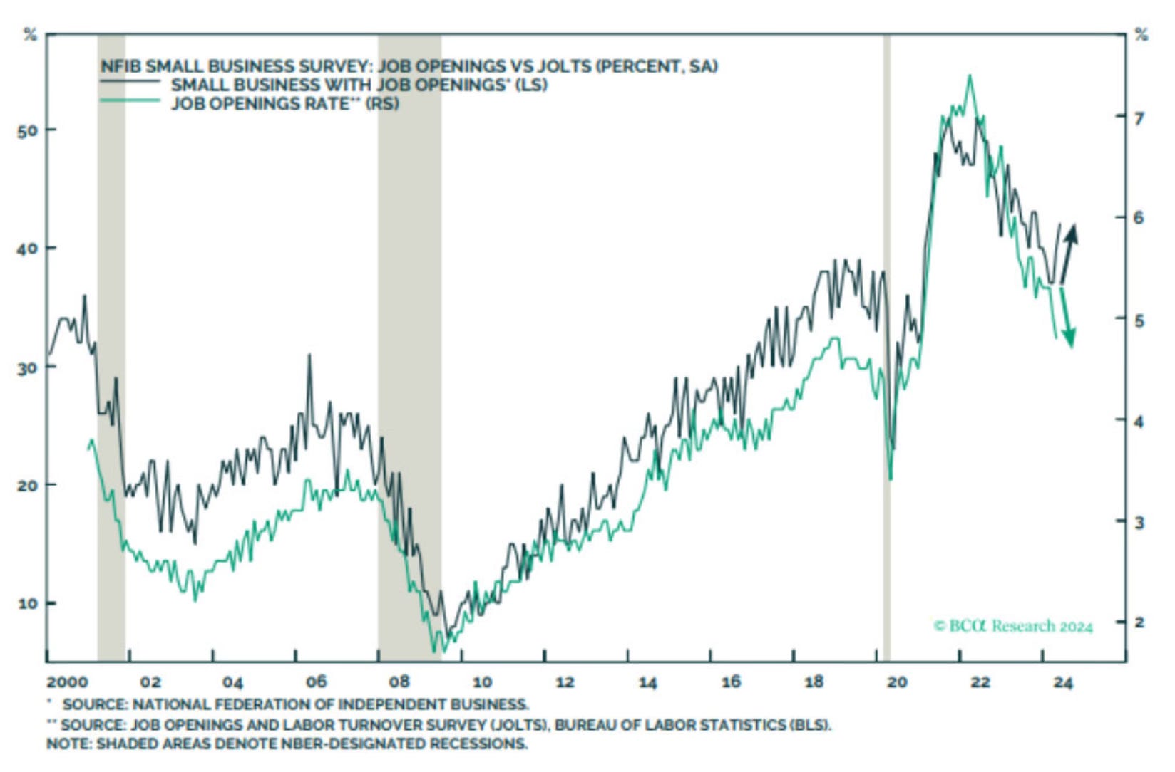
This is a chart that makes me wonder a bit on inflation, just as Peter Berezin says.
“For inflation to keep falling, the labor market must continue to cool.”
We’re starting to see small business job openings trend upward. A complete course reversal. Look at the opposite directions that these are taking. Does this signal that job openings are going to rise? We know what happened not long ago when this occurred. Hot labor market = Hot inflation
An area of employment that has been in free fall is trucking employment. I found this quite surprising. But as you can see the wide gap between truck transportation and the private sector YOY. This has usually led to recessions in the past as this chart illustrates.
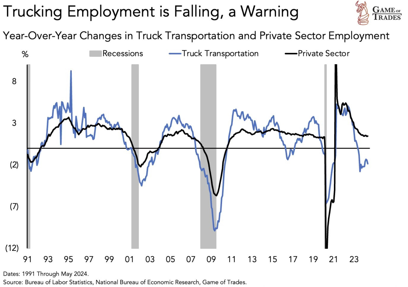
I’m a bit curious as to why the drastic drop off in trucking employment, when other areas and specifically the chart before this showed that small businesses are seeing job openings increase. Two charts signaling two different employment stories. We will see what proves to be more accurate
Apple Joins The Party
One of the biggest stories this year has been that the S&P 500 has climbed to new all-time highs while Apple hasn’t helped and drastically underperformed the index. That story changed this week. Apple has now joined the party.
At Tuesday’s open to the end of the week, Apple rose 10.4% on the back of its WWDC event. It was the best three day gain for Apple since August 2020.
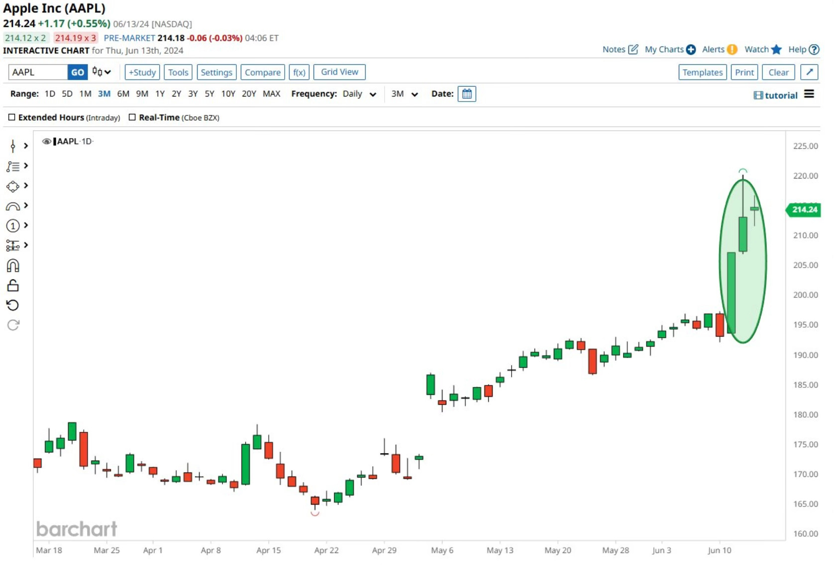
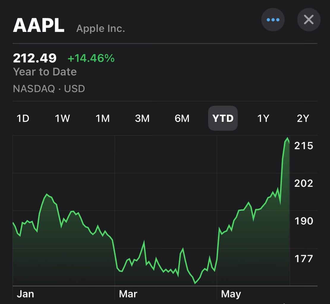
In a complete reversal from earlier this year, the stock is now up 14.46% YTD. Showing that once again, Apple is a stock to just own.
Investors really liked what the company had to say about AI and the plans ahead for the iPhone. A chart that I had been wanting to see but never have is in regards to the iPhone upgrade cycle. How many phones out there are due for an upgrade or how many models behind are the majority of iPhones?
This chart shows just that, as well as most owned models. Look at all the models 11, 12 and 13. That’s 77% of iPhones users who have a model that will be 3-5 years old.
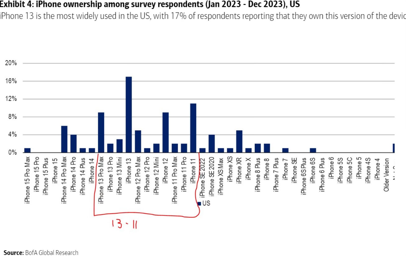
This makes another very bullish argument for this stock. Give users who are overdue a reason to upgrade their phone and they likely will. The announcements released this week show that may be coming.
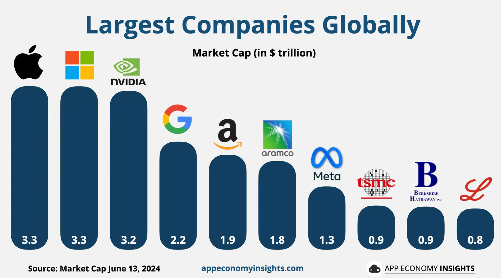
Apple also reclaimed the top spot as the most valuable company in the world. In the months ahead I expect to see Apple and Nvidia go back and forth for who’s on top.
I’ve long owned this stock. It’s one of my biggest winners ever and still one of my largest positions. That’s not going to change.
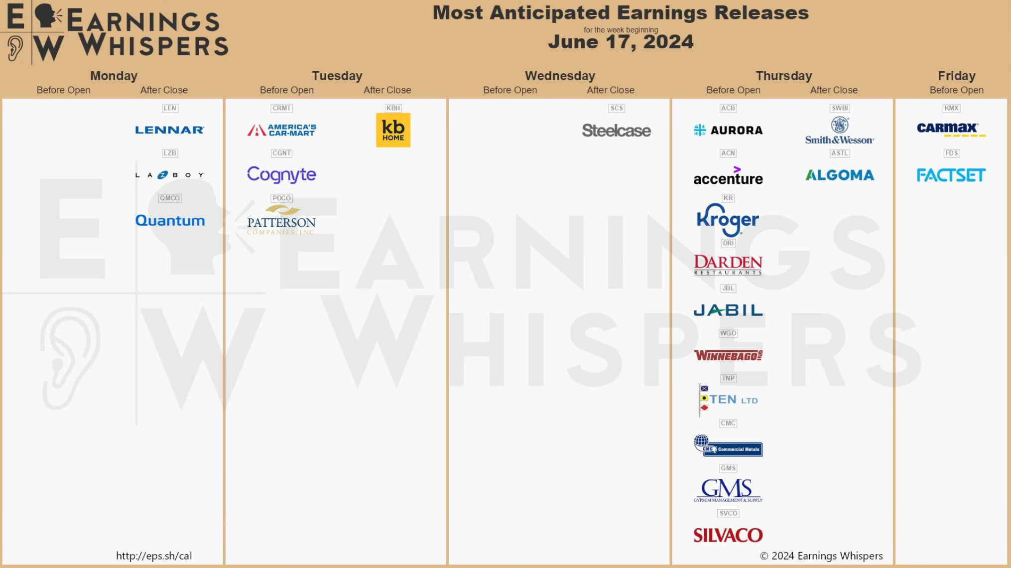
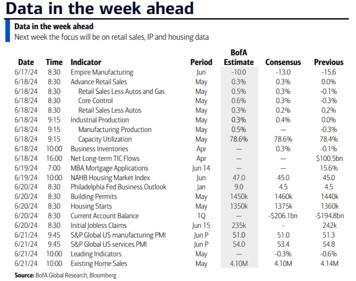
Upcoming Earnings & Data
The Coffee Table ☕
Kyla Scanlon who writes Kyla’s Newsletter had a really good post called, Why We Have a Housing Crisis. There is good analysis in here and some valid points to consider in the ever changing world of housing. It’s going to be interesting to see where the housing market leads over the coming months.
Just a reminder to make sure the beneficiaries on all your financial accounts and policies are updated. In Pennsylvania, a man’s ex-girlfriend may inherit his $1 million retirement account 34 years after they broke up. He named his girlfriend at the time in 1987 as his beneficiary. They broke up two years later but he never changed it. His estate has now filed a lawsuit. You can read the story here.
This was the best visual that I saw this week. It lists the largest companies by market cap and then the sector that they’re in. Some companies are much bigger than I realized. Such a cool chart.
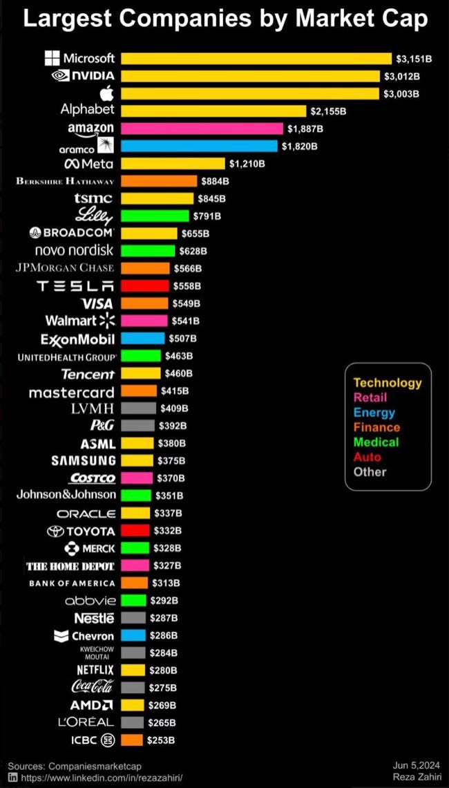
Source: Learn Something

Thank you for reading! If you enjoyed Spilled Coffee, please subscribe.
Spilled Coffee grows through word of mouth. Please consider sharing this post with someone who might appreciate it.
Order my book, Two-Way Street below.
