
Charts Tell The Story
The Story On Jobs and The Economy
There has been a lot of noise around jobs and the economy.
Sometimes the cleanest way to cut through the noise is to look at the charts. Numbers can be spun, opinions can be loud, but the lines on the page don’t lie.
We need to unpack what’s going on. What are the charts and data telling us? What’s the full story? To do that, let’s look at the charts to see what story they’re telling.
Let’s dig in.
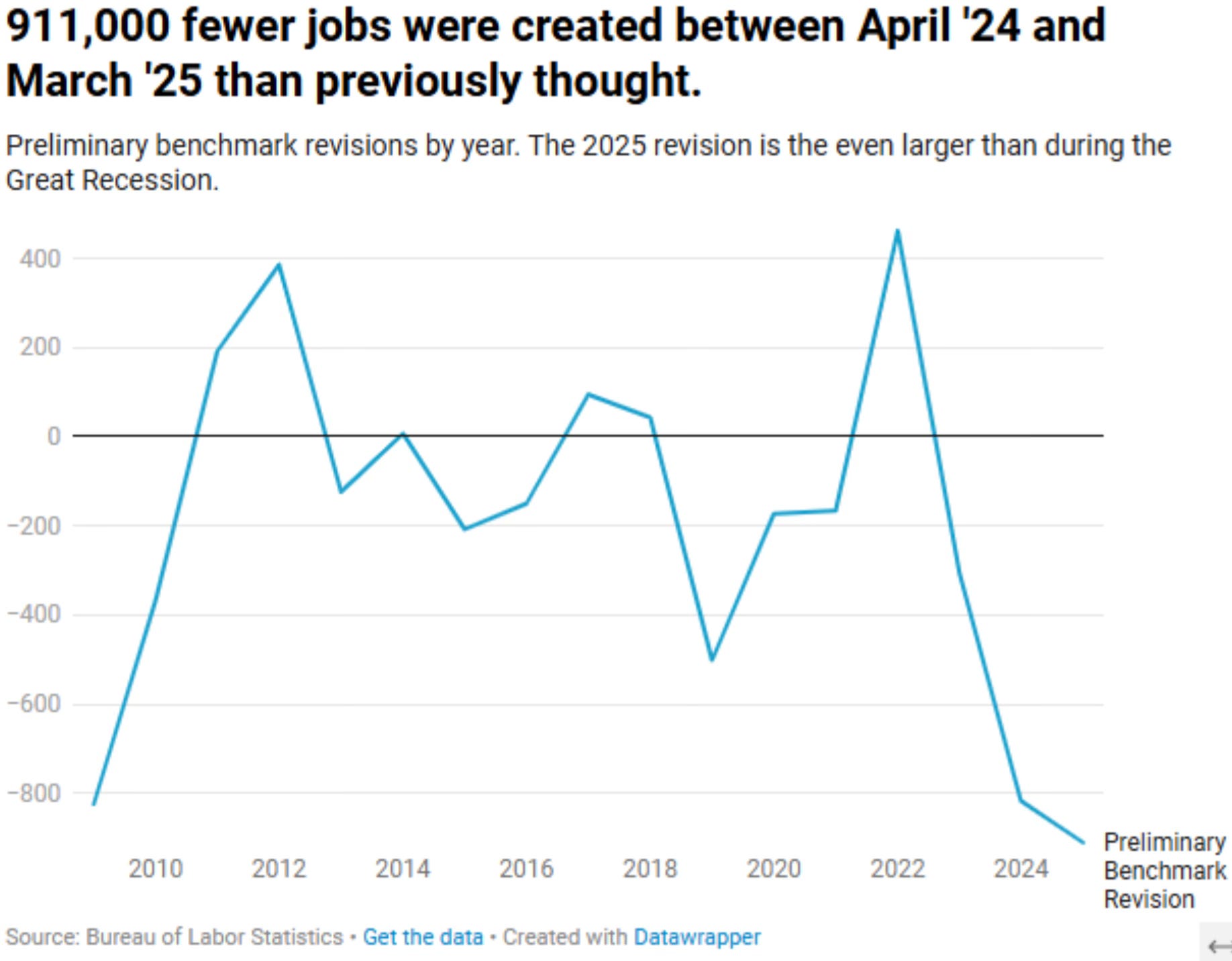
Yesterday the U.S. Labor Department’s payroll revision showed that 911,000 jobs weren’t created from April 2024 to March 2025.
That’s almost 1 million jobs that never existed. About 40% of all jobs that were said to have been added in 2024, never were.
This revised data confirmed that an already weakening labor market, is even weaker than we thought.
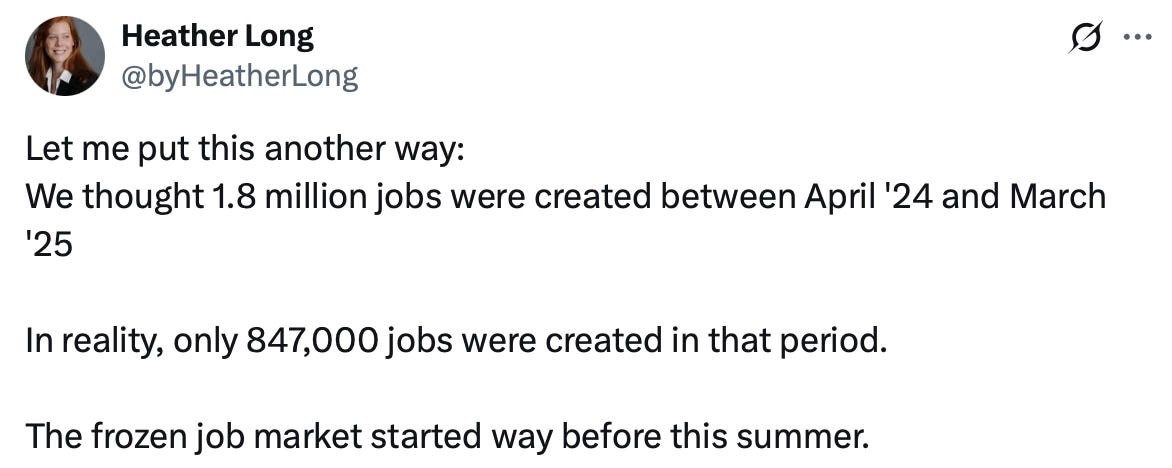
In fact, the weakened job market started a long time ago, as Heather Long points out.
If this were the revisions until March of 2025, what does that say about what has recently been reported with the jobs numbers.
Over the past three months, the U.S. economy has hardly added any jobs.
June was actually negative. That was the first decline since December 2020.
August only added 22,000 jobs. The expected number was 75,000.
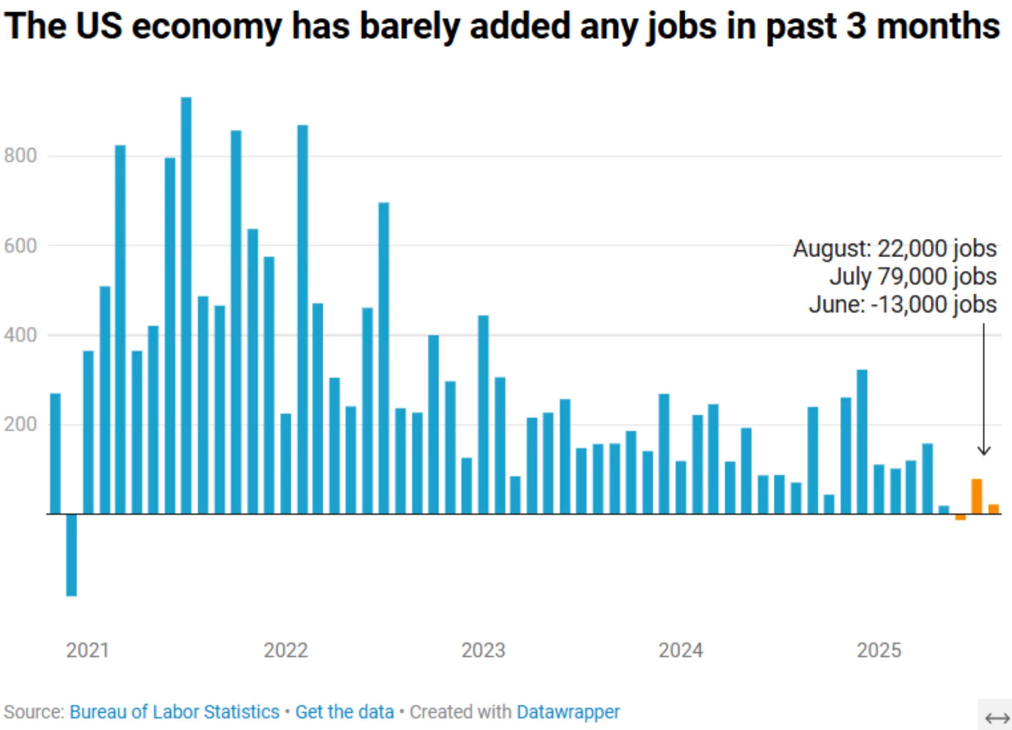
Falling payrolls are a worry. It’s the classic early sign of economic trouble and an indicator of recessions.
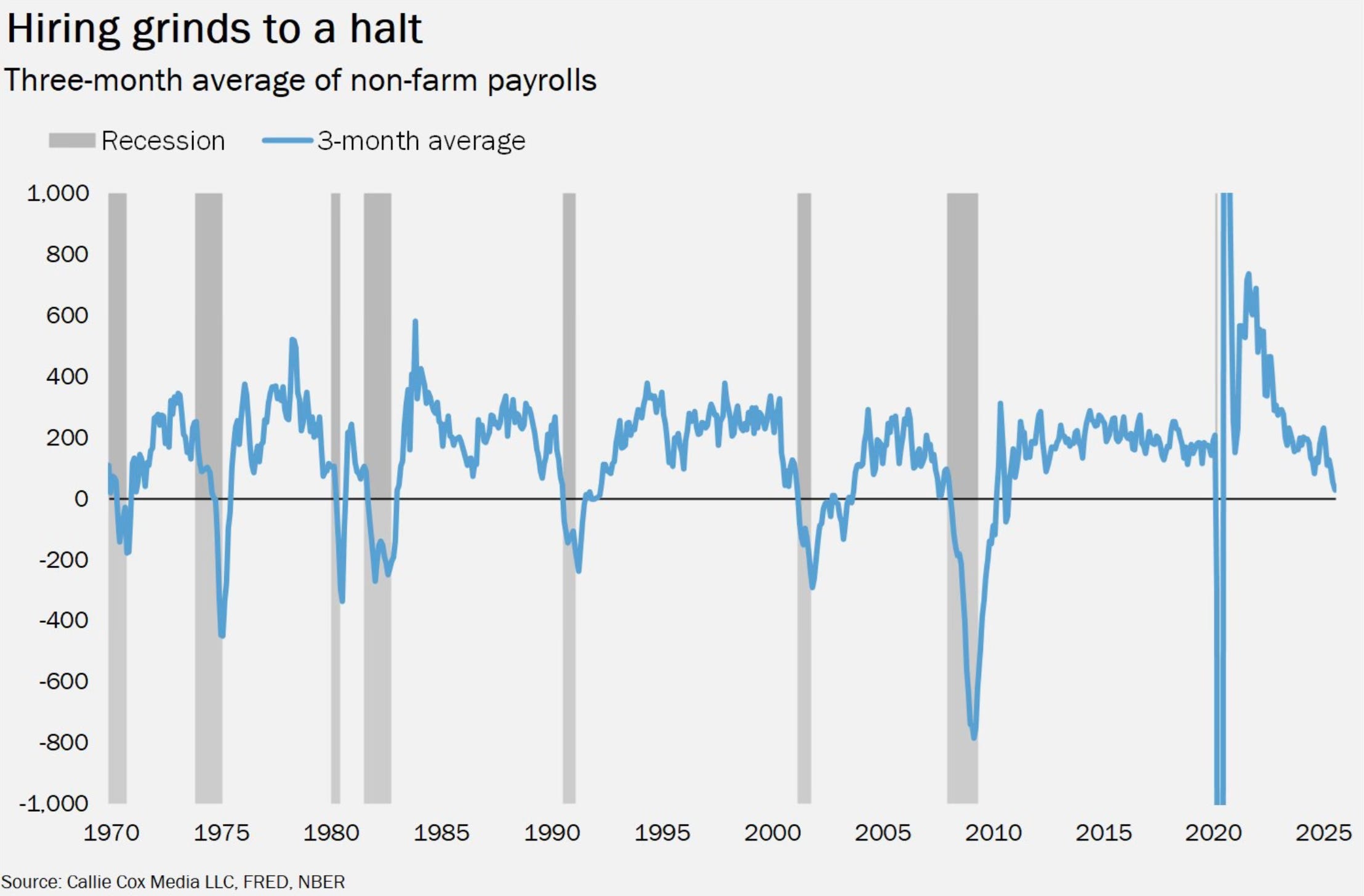
Within all of these job numbers, there are two areas that I like to focus on. Peeking under the hood at these two data points, historically gives the clearest picture on what’s to come.