Charts & More Charts
25 Visuals That Caught My Eye
As I’ve come across charts in my research and reading, it’s impossible for me to share them all with my readers. I’ve even had some good charts put together for me that never make the cut. I’m only able to share so many in my newsletters and notes.
These are important visuals that I feel are important to share with you. Many of these could prove to be valuable and I think you the readers of Spilled Coffee will find them beneficial.
Here are 25 of those charts.
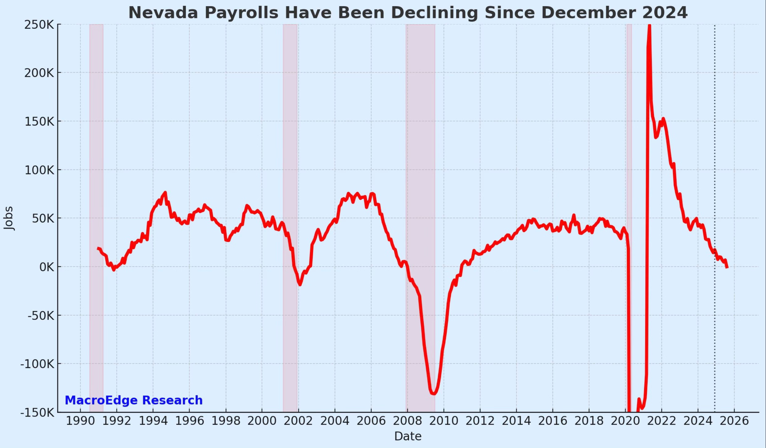
When we see the state of Nevada, we automatically think about Las Vegas. That’s what makes this chart so relevant. Nevada payrolls have turned negative year-over-year for the rest time since the pandemic.
As Nevada payrolls historically start to fall, you can see that many times it has been followed with a recession. This bears watching.
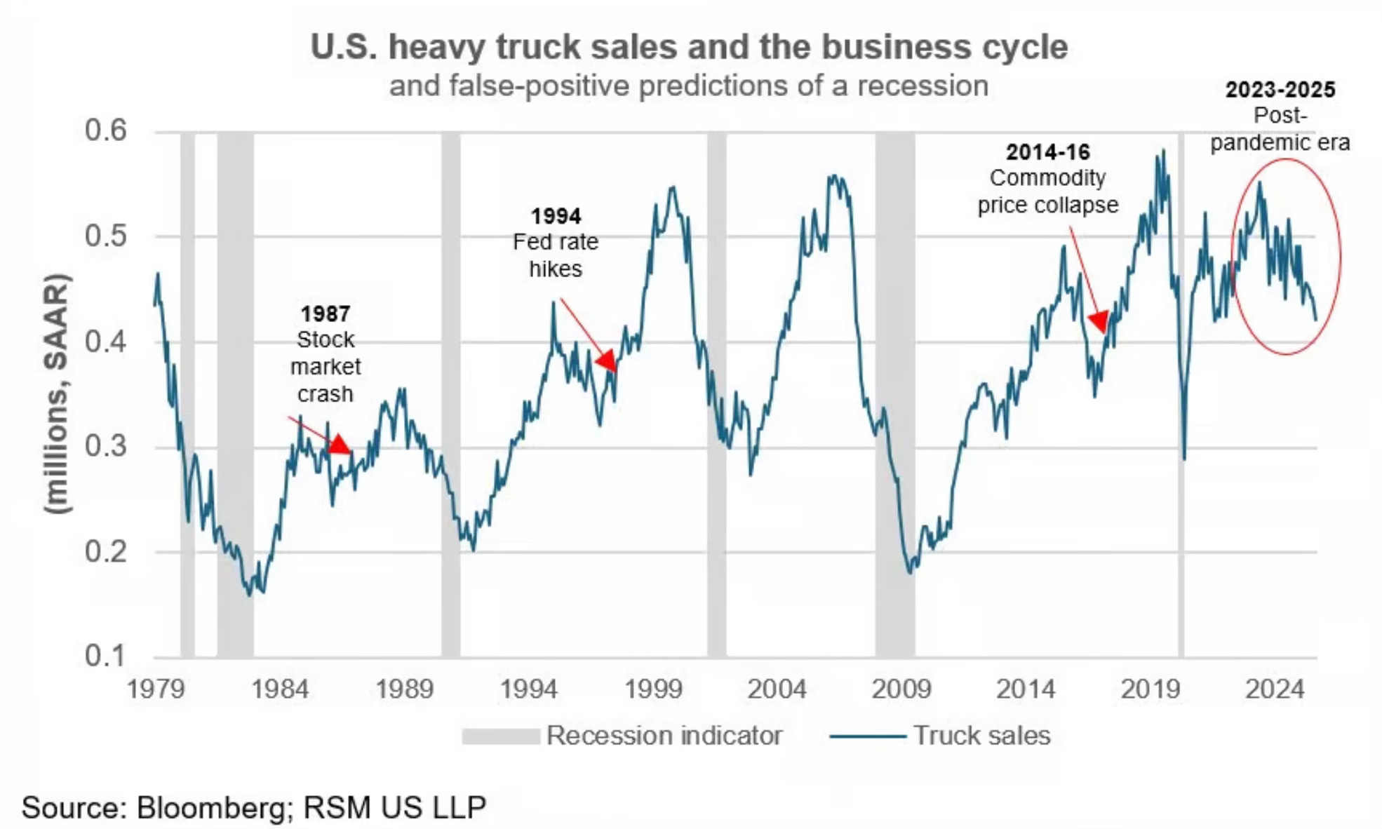
The sales of heavy trucks are sliding. You can see that going back to 1979 that most times a collapse in heavy truck sales has been followed with a recession. We will see if this continues.
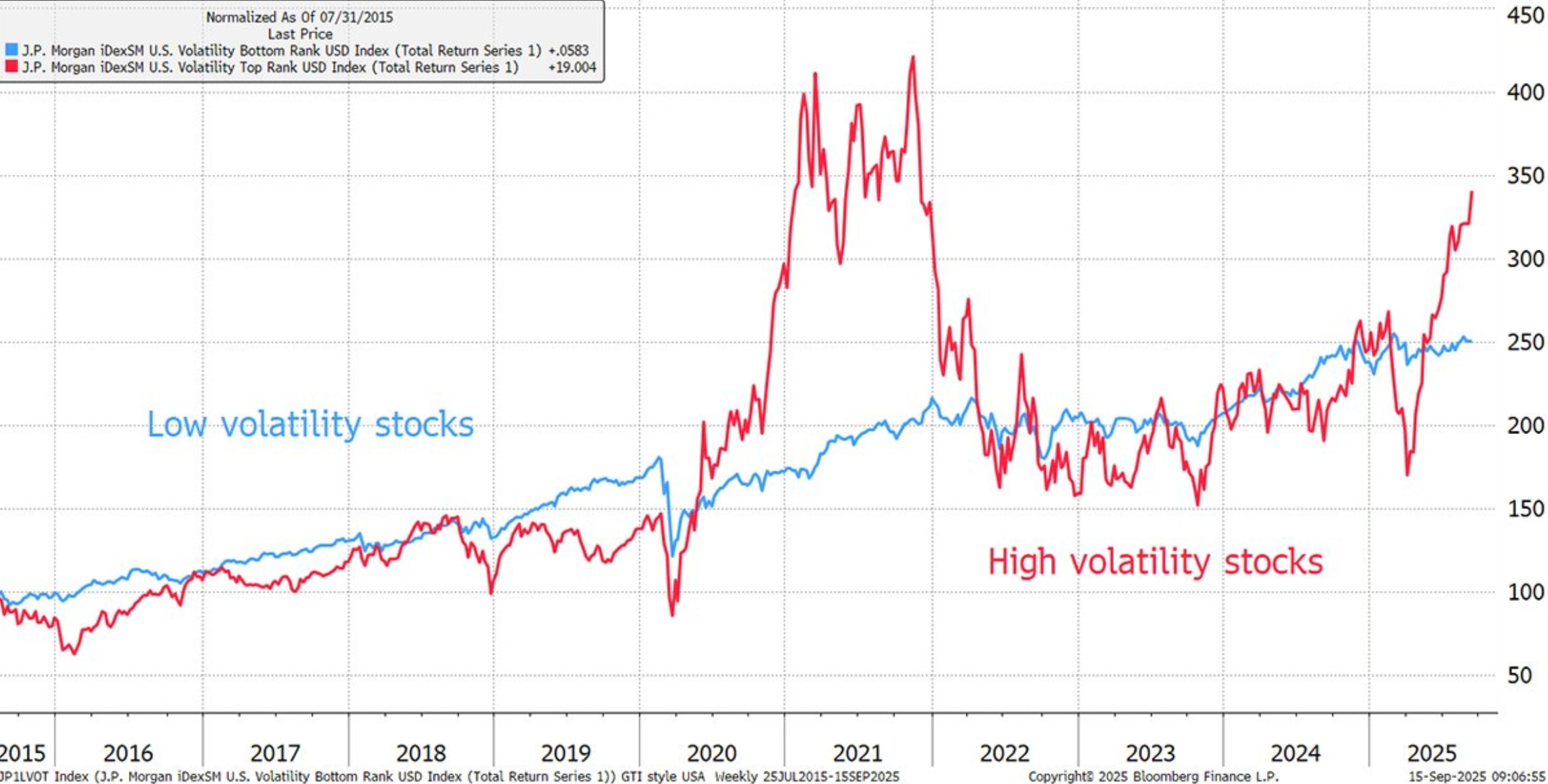
The high volatility stocks are looking to take liftoff again. The last time we saw these levels were back in 2021. Let’s hope that what followed, doesn’t happen again.
The reality is that at some point what goes up must come down. It’s just a matter of how long before it does.
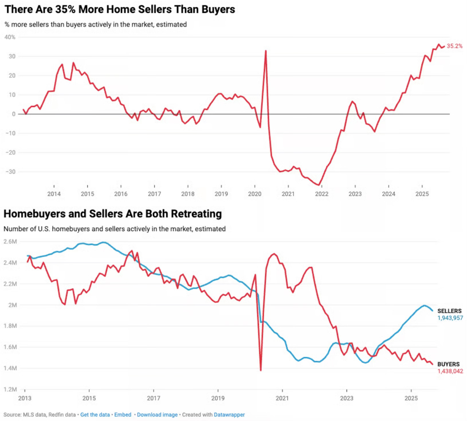
The housing market now has 35% more home sellers than buyers. 2025 has been the strongest buyers market on record. Unfortunately that hasn’t mattered as the housing market has remained frozen.
You can see in the second chart that both buyers and sellers have been retreating. This has been a broken housing market for some time and lower mortgage rates alone aren’t going to fix this.