Charts & More Charts
A Graphical Tour of What’s Moving Markets and Minds
As I’ve come across charts in my research and reading, it’s impossible for me to share them all with my readers. I’ve even had some good charts put together for me that never make the cut. I’m only able to share so many in my newsletters and notes.
The number of great visuals have started to compound over time. Many of these could prove to be valuable and I think you the readers of Spilled Coffee will find them beneficial.
Here are 25 of those charts.
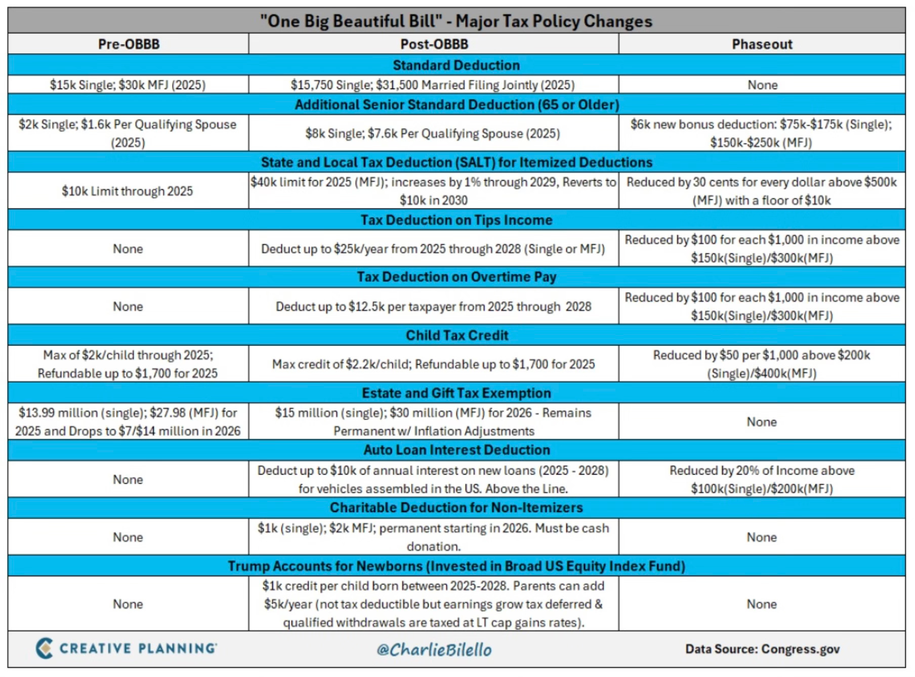
Have you wondered what’s in the Big Beautiful Bill? Here is a great visual that spells out what’s changing.
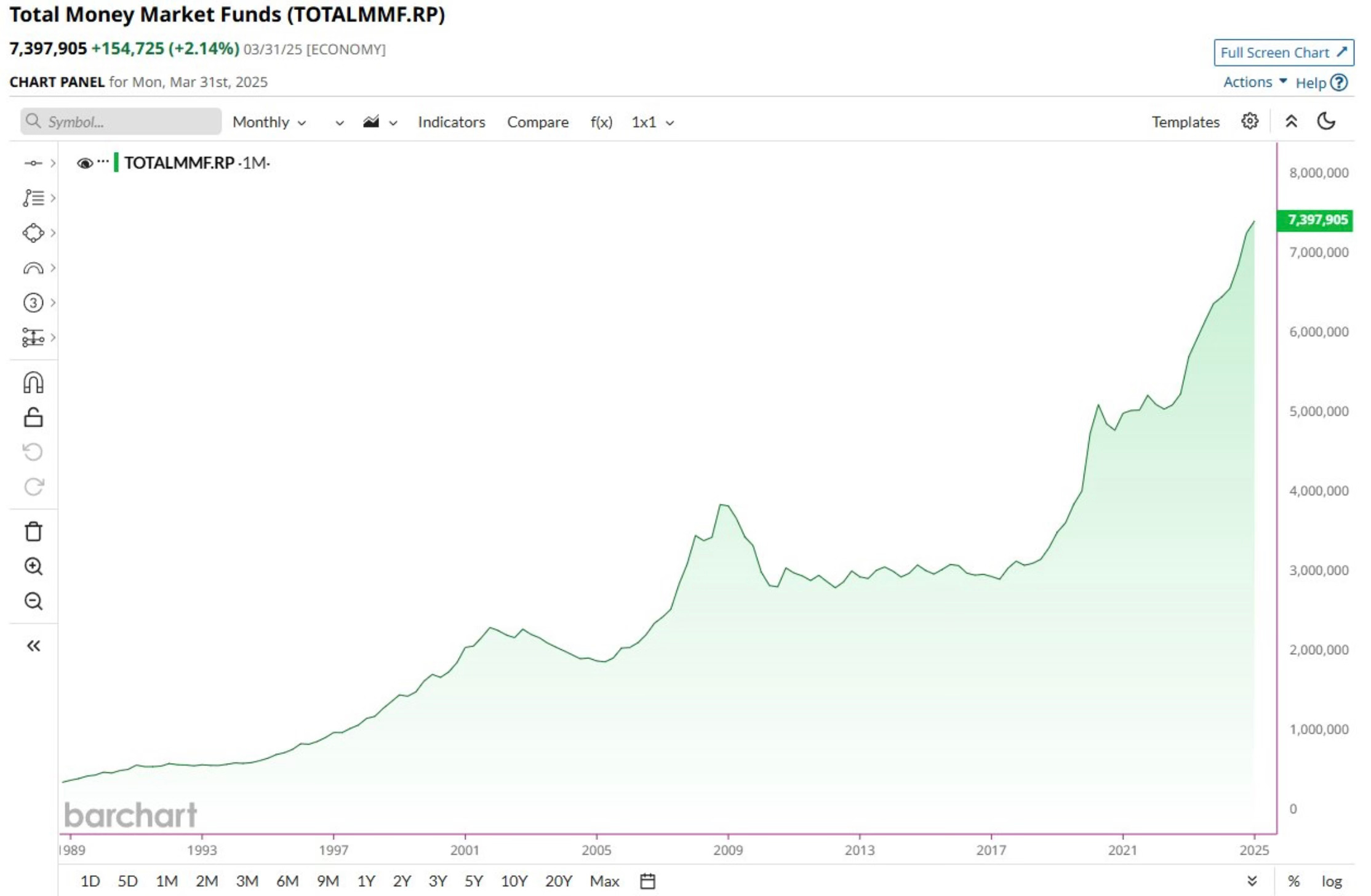
We hear a lot about the large amount of money that’s sitting in Money Market Funds. In fact, $7.4 Trillion is now sitting in Money Market Funds. That’s another new all-time high
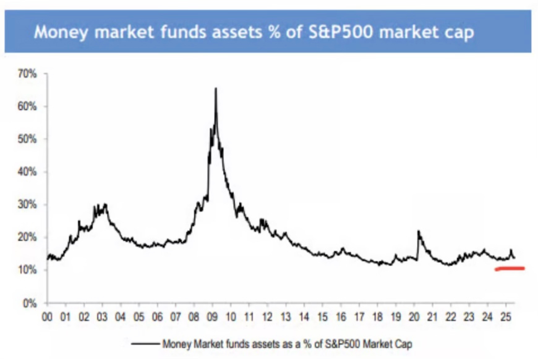
Yes, that $7.4 trillion sounds like a lot. But it still remains a tiny percentage of total assets. You have to keep that amount in context. I like how this chart shows money market funds assets as a percentage of the S&P 500 market cap.
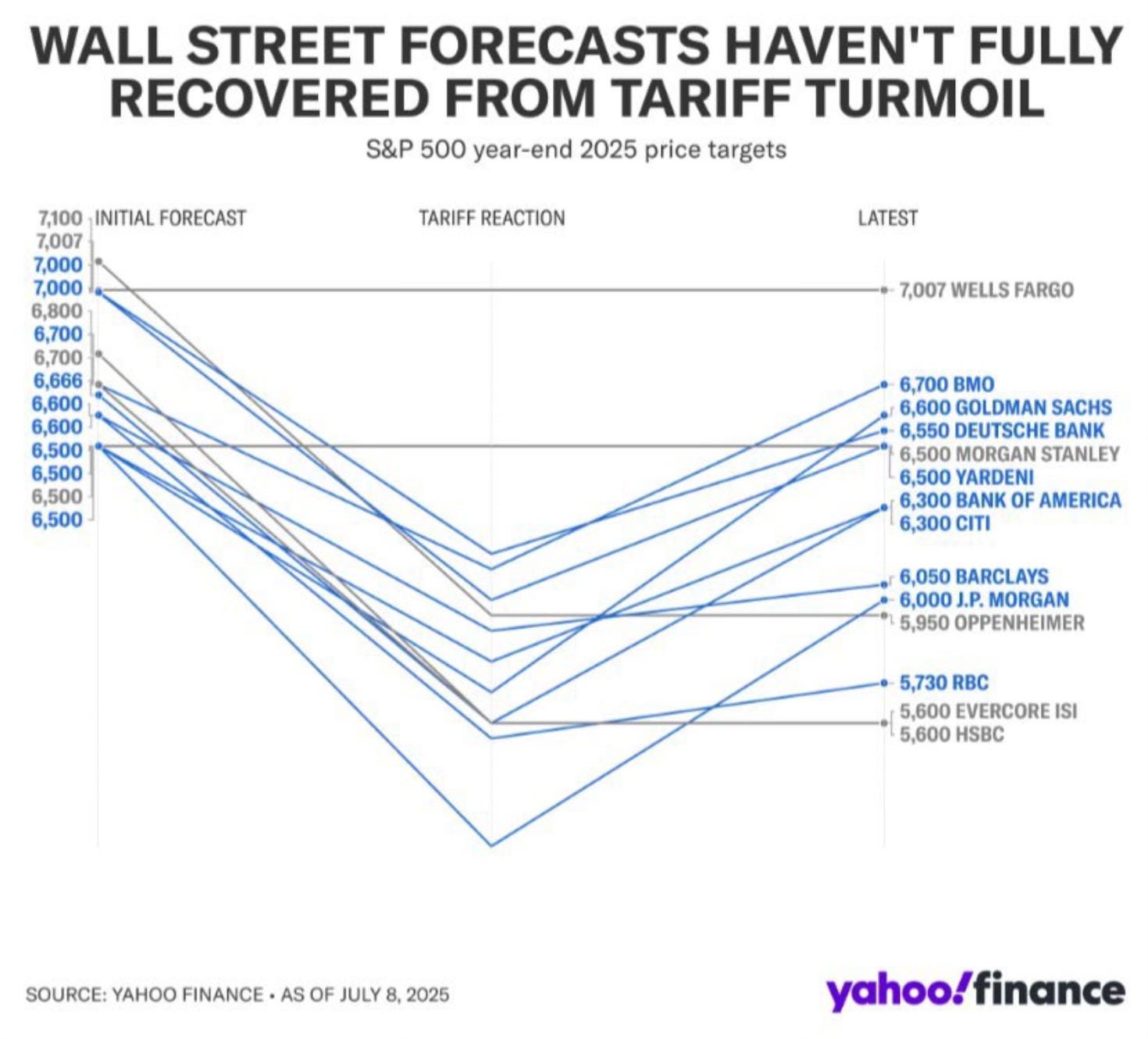
I’ve talked about how Wall Street forecasts just seem to follow what the market does. They make changes numerous times throughout the year. This visual shows exactly my point. All most do is chase and react to what the market is doing. It isn’t really a forecast and to me these just make for good TV discussions.
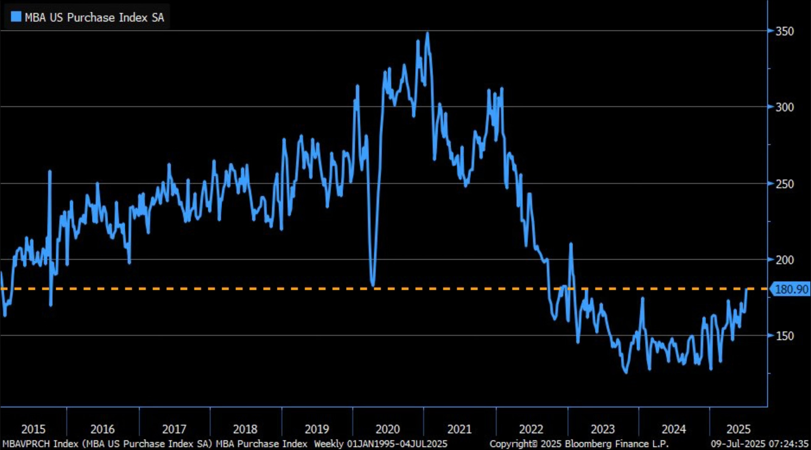
Mortgage applications have started to show signs of life. They’ve now rose to the highest level since February 2023.
This housing market can only stay froze for so long. It eventually has to crack. I’m still of the belief that if we see mortgage rates come down, it will unleash a buying frenzy with housing.
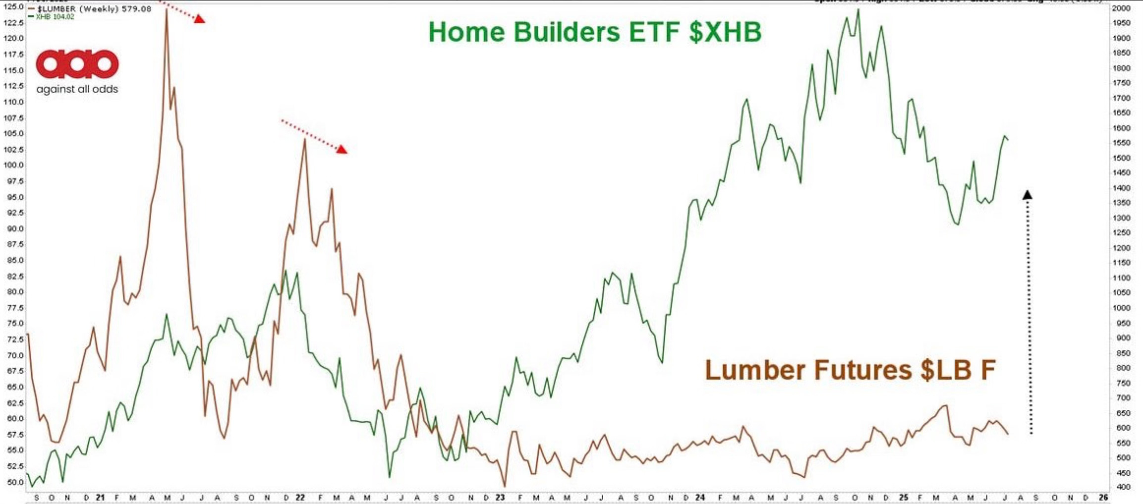
Home builders have already started to move. They bounced off the low and are now surprisingly above the 200-day. It’s interesting though how in this chart they looked at lumber. It hasn’t moved and has been going in the opposite direction. I can’t envision that lasting.